I adjusted the colour to really bring out the red coat of the little girl, which I think is really symbolic. I also adjusted the pitches on the audio, faded out the end and added some credits.
One shot - chalk emotions new edit from Harry Cook on Vimeo.

Tuesday, 7 December 2010

My second edit of animation
For this one, I changed the camera angles, used some different lighting and shifted the whole image down because last time the rendering cut some of it out! Comments would be great!
Tv ident take 2 from Harry Cook on Vimeo.
Thursday, 2 December 2010
Interactive Space
I have just finished my project for the interactive space module. I found it a lot of fun and was able to pick up the basics, such as the html coding and dreamweaver, relatively quickly. I thought it was quite a simple project and less time consuming than the previous projects in animation and moving image. The most difficult part I found, was thinking of a good storyline to use. This was because I wanted to think of something original, whlist keeping it interesting and engaging.
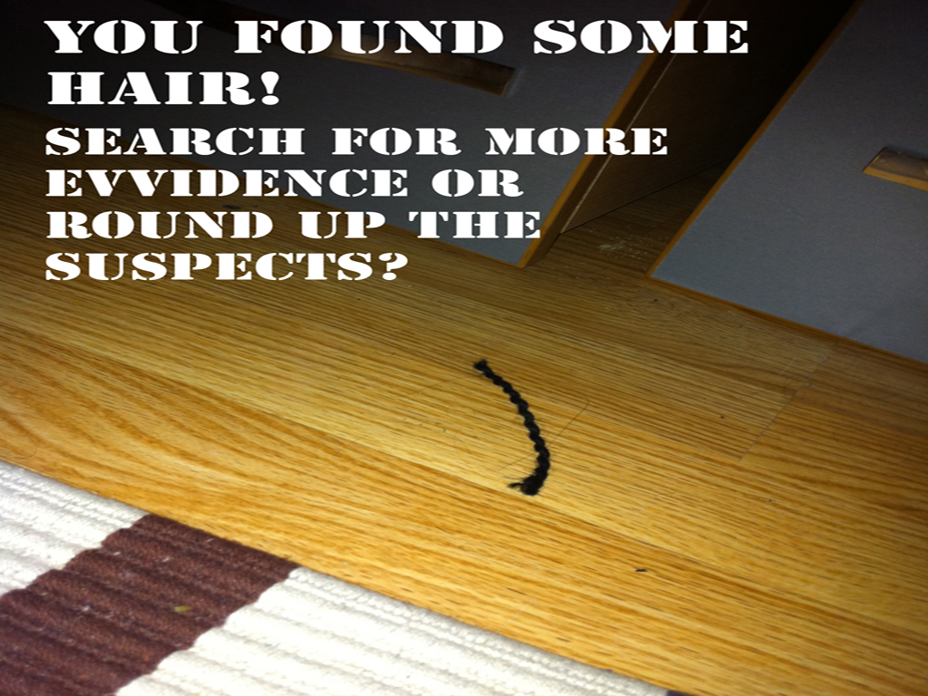
My first idea, was to do a cookery themed project, however tw issues arose with it. Firstly someone from a previous group had done a similar idea, and secondly it was highlighted to me that it may be difficult to keep it interesting and engaging for the user. I therefore moved on from that idea, and was really strugglingto think of something else. I did a braintstorm to try and find inspiration, I knew it had to be fun and engaging and that led to me to think that a mystery of some kind would work quite well. You do not know what the outcome could be so there is an element of suspense. So for my final idea I came up with the idea of a murder mystery. The basic story is that the user must search for clues around the room, and decide whether they have a enough evidence, they are then confronted with two possible suspects and the user must decide which one is the killer.
Once I had my images, I edited them on Photoshop, adding text and slight colour adujsments. I then was able to add the hotspots on the images, using dreamweaver, which links together the images. This was a fairly straight forward task and with a few tweeks I got there. It all works pretty well, but I think next time I would make it more elaborate.
Overall, I really enjoyed the module, it was a really interesting project and suited what I like doing, I am looking forward to doing more challenging projects in the area!
The fully working project will uploaded to www.makingnewmaps.com in the next few days, for now here the images I took, altohugh I have not included the image which reveals the killer, I'll leave that for you to decide.


My first idea, was to do a cookery themed project, however tw issues arose with it. Firstly someone from a previous group had done a similar idea, and secondly it was highlighted to me that it may be difficult to keep it interesting and engaging for the user. I therefore moved on from that idea, and was really strugglingto think of something else. I did a braintstorm to try and find inspiration, I knew it had to be fun and engaging and that led to me to think that a mystery of some kind would work quite well. You do not know what the outcome could be so there is an element of suspense. So for my final idea I came up with the idea of a murder mystery. The basic story is that the user must search for clues around the room, and decide whether they have a enough evidence, they are then confronted with two possible suspects and the user must decide which one is the killer.
Once I had my images, I edited them on Photoshop, adding text and slight colour adujsments. I then was able to add the hotspots on the images, using dreamweaver, which links together the images. This was a fairly straight forward task and with a few tweeks I got there. It all works pretty well, but I think next time I would make it more elaborate.
Overall, I really enjoyed the module, it was a really interesting project and suited what I like doing, I am looking forward to doing more challenging projects in the area!
The fully working project will uploaded to www.makingnewmaps.com in the next few days, for now here the images I took, altohugh I have not included the image which reveals the killer, I'll leave that for you to decide.




Wednesday, 17 November 2010
Forrest Gump
We had a lecture about the layout of design and how to do it well and do it wrong, as a task we were given an example of a bad layout design and asked to improve on it, we got given a Forrest Gump DVD cover. However there was not a lot of design faults, the only identified ones were that the title was on the right side of the layout which is not the optimum space for reading and meant it was the not text that was noticed first, secondly the text was not particularly well aligned which helps to make text pop out
This is the original DVD:


This is the original DVD:

and these are my designs:


Tuesday, 16 November 2010
One-shot Chalk Emotions - Editing
We finished editing today, the process was largely straightforward but quite time-consuming. I took a leading role in the process, which I was happy to do and I enjoyed doing the editing. We sped up the film to 675% of its original speed this gives a more engaged feel, however we slowed it down at the end for the pan shot. In addition to this we laid down a audio track which includes 2 music tracks which changes to show the developing emotions, overlaid onto that is a heartbeat ambient noise which signifies the change of mood, we also took away the original audio track. With a bit of a colour alteration a lot of time-consuming rendering and exporting that was the editing done. This is our final cut, enjoy...
One-shot film chalk emotions from Harry Cook on Vimeo.
One-shot film chalk emotions from Harry Cook on Vimeo.
Monday, 15 November 2010
Connected Marketing Logo
My Dad needed a logo for his new company and asked me to design it, using Adobe Illustrator I set to work and mocked up a few ideas, I wanted it to be quite a bold design but knew that simplicity and clarity are key to a good logo, it must grab attention with good use of colour and shape.

These were my designs:
We decided to go with the top right design, it stands out, with use of complimentary colours whilst maintaining a professional feel. The imagery of the shapes also fits with the word connected as the pieces all connect together which is effective link.
Here is the logo on the finished website:
http://www.connected-marketing.co.uk/
With a bit flash added to the design it finishes it off nicely.
Here is the logo on the finished website:
http://www.connected-marketing.co.uk/
With a bit flash added to the design it finishes it off nicely.
Thursday, 11 November 2010
On the set of our one-shot
Yesterday we filmed our one-shot film, after rain had postponed filming by 24 hours we were pleased to be able to get it done and got lucky with the weather. The idea was to have a little girl who was drawing on the ground with chalk, we want to express her emotions through a period in her life, we depicted the break-up of her Mother and Father, starting off with a happy family, then the break-up, and finally how the little girl is feeling afterwards. The emotions went from happy to worried and then sad.


As the camera-man I first had to adjust the white-balance so that the colours were true to life and as effective as possible. As we were filming in direct sunlight it was also necessary to reduce the iris a bit to ensure clarity of the video and that it was not too bright. It was a challenge to get the camera set up in the optimum place and it took quite a while and a lot of different experiments with alternative angles and heights of the tripod until we found the right one. As we were drawing chalk on the ground and the limited time and areas we could film, we knew we effectively only had one take to get it right, however as we were taking off the audio track in post-production we were able to direct as we were filming which was vital to it being done first time! Being a one-shot film obviously meant we had to film continuously and without different angles etc. However we were allowed one pan or zoom, we decided it would be a nice effect to pan up as the girl finished the drawings and follow her as she walked away and then pan back down (in one movement) to end on the images, this worked well and was nice finish.
In post-production we will remove the audio track and replace it with suitable music to go with the emotions, and also ambient noises to go with the emotions, such as; laughter for happiness, rowing and shouting to depict the break-up and then crying to show her sadness. The audio on the film is going to a vital element to the film as it will bring the emotions to life and hopefully create a powerful depiction. The film will also be sped up for effect, this will engage the viewer more, because otherwise it is not particularly exciting to watch someone slowly draw out pictures. If we not limited by the brief I think it would also be effective to reverse the film at the end the create the effect of her wiping it away at the end, almost to show her covering up and hiding her emotions.
Overall I have really enjoyed this project it was a lot of fun, I am happy with outcome, and I am sure after editing it will be a really effective one-shot film. The final edit will be uploaded next week but for now here are some production photos...


Subscribe to:
Posts (Atom)