Two websites that will influnece my design. Both use limited colour palletes and have a minimilistic design. They use innovative scroll and navigation and I like the idea thatall the content is on one page and the links move you up your down the page.

Thursday, 14 April 2011

Monday, 21 March 2011
Thursday, 10 March 2011

Wednesday, 9 March 2011
theinsider.com
Had an idea for a website, which is effectively a newspaper that you can compile yourself, with news that you want to know about and then chat and share it with your friends. The social network of news.


iPad 2
Last week the new iPad was launched, it boasts much faster processors, running with the Apple 5 chip which operates 2x faster the previous incarnation, it also will have graphics that are 9x better which is rather impressive and i'm sure will make the clarity of the screen visually awesome. Another development is that is 33% thinner than the previous, and to put that in to perspective, that makes it thinner than the iPhone 4, which is the thinnest smart phone on the market, so it is an impressive statistic.
I've always been torn when it comes to the iPad, it is a great device, and functions really impressively, it is brilliantly designed, but then what do you expect from Apple. However inside I know it is a massive con. It is well over priced and not really necessary as a standard lap top and even the iPhone do exactly the same functions as the iPad. Still, I find myself wanting one so much, it is not so much what it delivers, but how it delivers it, and that is what will make the iPad 2 so succesful and popular.
I've always been torn when it comes to the iPad, it is a great device, and functions really impressively, it is brilliantly designed, but then what do you expect from Apple. However inside I know it is a massive con. It is well over priced and not really necessary as a standard lap top and even the iPhone do exactly the same functions as the iPad. Still, I find myself wanting one so much, it is not so much what it delivers, but how it delivers it, and that is what will make the iPad 2 so succesful and popular.
Filming Part 1
We started filming earlier on in the week, focusing on getting all the close up shots done and things that didn't include dialogue and such. It went fairly successfully and we were able to get all the shots we needed, we would have liked to get some other shots done on the day as well, however we did not have the correct lighting and decided it would be better to wait and do it properly than film shots that we later were disappointed with. We made sure we did every shot to best quality possible, this meant a lot of time was spent find the right angle and position for the camera and make sure the lighting we had was suitable. Filming will continue later in the week...
Friday, 25 February 2011
Film progress - Week 2
Yesterday we pitched our idea for our film. We already had the script, so knew the basic ideas, but we had to put forward our take on it; how will make it interesting and unique, and the style and genre we were going to incorporate into it.
Our script is about a guy that knocks on a random door and claims to hav been invited to a party there, invites himself and makes himself at home, all whilst the flat owner, is trying to figure out who he is and why he is actually there. We have decided to take quite a dark and tense approach to out interpretation. We want to make the intruder quite sinister and really play on the mysterious way of who he is and why's he's there. In contrast the other character will become incrasingly unsettled and and will feel totally out of control of the situation as the intruder imposes himself more and more. In the original script the intruder makes a sandwhich, we have decided to adapt this slightly, in ours the intruder will be interupting on the other characters preparations for a romantic meal with his girlfriend. This allows to play around with a really effective atmosphere, as the room will be candelit, which will produce effective shadows and allow the intruder to have a more imposing persona. Also the original script starts with the intruder knocking on the door, however we want to add a bit at the strart of ours which shows both contrasting character's getting ready, with quick cut shots between each of them and the opening credits, the shots will never reveal the intruders face until the other character sees him, so your're in the same situation as the intruded character. This will build into the story more effectively and leave the viewer wanting to know where it is going.
Today we organised a schedule for props, location, and filming, so we are now quite organised, we also made sure we all know waht we are doing and where we are heading. We also set up a blog so we can share our ideas and progress on there!
Thursday, 17 February 2011
First Moving Image class
Today we had our first lesson for moving image. We got given a script that we have to interpret via a short film. The script is quite good and our group got some good ideas going around, which hopefully we can turn into a successful short film. Our lecturer seems like he will be really good as well, being a leading script writer on shows such as Shameless and New tricks. So hopefully I can learn a lot from him. Importantly I think I have a good group so we should be able to make this a success!
We also assigned our roles today, I have taken on the Producer's role so will be in charge of making sure everything is going to plan etc.
Me - Producer
Joe - Director
Hollie - Assistant Director
Mark - Editor
Sam - Camera
Naomi - Lighting and Sound
We also assigned our roles today, I have taken on the Producer's role so will be in charge of making sure everything is going to plan etc.
Me - Producer
Joe - Director
Hollie - Assistant Director
Mark - Editor
Sam - Camera
Naomi - Lighting and Sound
Presentation Lecture
Yesterday we had a lecture working with the other narrative design students. It gave us a chance to talk to other students about our work, and get there take on it. As well as listen to what their courses and projects are like, and giving them some feedback where I could. It was really interesting to see how much our courses overlapped and was really useful to get different perspectives on my work and how to improve it. I was interested to hear about the kinds of projects they undertake and how they go about them, and I was pleased to be able to help them with any problems they had, by having a multimedia perspective on their issues. It was a really good opportunity to sell myself as a designer and I picked up some really good feedback to use in the future. Overall a great success!
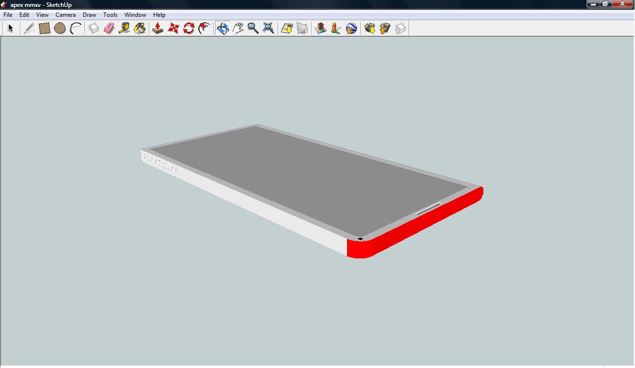
Mobile phone design
I was bored one afternoon so decided to mock a design for a mobile phone I thought would be cool, using Sketch Up.


Animation
I have finished my animation project now, well when I say finished I mean we're moving on to out next carousel, however my animation piece still has some work to be done. I found the project really challenging, and have struggled to complete it in time. There was a lot of content to include for the project, and this was using software (3ds max) that I have very little experience using and a not many skills. That means that everything takes that much longer to do because I am looking for ways to do what I want, and when I found the right tool, I'm not always sure of the best way to use it. I also think that the pace of the main workshop was too fast, and didn't give me a chance to keep up with what we were supposed to be learning, and once you miss a step, it is very difficult to catch up or you find that it does not work out at the end because you've missed a step. In DP1 I was able to keep up a lot more easily, despite having no experience using the software. I believe that the gap between the two projects was too large, for someone with very little knowledge of the software.
On the other hand I think the brief was really interesting, and with a little more time I think I should be able to have a fairly good piece. I came up with the idea of old fashioned London theme murder trail for my ride. I thought this would be a bit different and had some good ideas for scare scenes. My inspiration for the idea came from a mix of Jack the ripper and the ride at the London Dungeons, which is set in London streets and has a really effective eerie feel. I wanted to create a really dark and damp feel to my ride, so I played around with a lot of lighting and fog effects to really set the scene for the ride. I did this by adjusting the volume light and fog in the Environments settings. I think this is one of the most effective aspects of my project and the part I am most pleased with. My scare scenes were a old graveyard to start the ride of, with creaking gate at the end to get the riders attention right at the start, the ride then goes up a hill, and through a tunnel and which point a body drops down at the end, this conceals the track dropping away and the rider is convinced that they will hit the body before dropping away, it then comes down to a old London street, with rows of houses, with lots of dark and dingey alleyways, you can hear footsteps and evil laughs, the cart then turns into a dead end where it is revealed there is a body on the wall and a message scrawled across it, 'There is no escape now!.' I think that the scare scenes work well, however I found it quite difficult to make them work effectively. I researched techniques via online tutorials which really helped me create some of the effects.
To develop my ideas I created 3d models of the track using wire, this allowed me a different perspective of the track and the confinements I had to work to. I also used Sketch Up to mock up ideas for the cart which were really useful to let me see it in 3d before transferring it to 3ds Max and did initial sketches of my designs for my scare scenes which made it easier to replicate them in 3ds Max. I researched images and created a mood board on my blog to give me inspiration for my scare scenes, as well as looking at examples on YouTube and researching the ride at the London Dungeons. These methods of research were really effective in giving me inspiration, the only other things I could have would have been maybe to visit an actual ride to gain ideas.
One of the most difficult aspects of the ride was to make the houses look as realistic as possible. I did this extrude part of the material bitmaps to make it look slightly 3d as well as experimenting with different lighting effects to cast realistic shadows.
Overall the project was a difficult one and I am pleased it has finished, although I still have some developments for my ride. I think if I was to do it again I would ensure that I planned out my time a lot more effectively and ensured i was fully up to date with the work at each stage of the design process.
Thursday, 3 February 2011
Beer Festival Competition
Last year I entered a competition to design an logo for an upcoming beer festival in Oxford. It has to use only 1 colour, preferably black so that it couldeasily be transferred on to classes and t-shirts. It also had to include important information about the event.
For my design I took the theme of beer and though it would be a good idea to have the beer glass as the central part of the logo. To make the the text more interesting I thoughtit would be a good idea to have it tumbling into the glass, like pouring a pint. ( I also played around with the glass upright and the text filling the glass) To identify the logo alongside Oxford I thought it might be quite nice to have to Oxford skyline at the bottom of the glass. This also creates an image of the event details tumbling into Oxford.

For my design I took the theme of beer and though it would be a good idea to have the beer glass as the central part of the logo. To make the the text more interesting I thoughtit would be a good idea to have it tumbling into the glass, like pouring a pint. ( I also played around with the glass upright and the text filling the glass) To identify the logo alongside Oxford I thought it might be quite nice to have to Oxford skyline at the bottom of the glass. This also creates an image of the event details tumbling into Oxford.

Graveyard animation
Animated version of my graveyard scene, just playing around with light and movement of time. For my haunted ride I want to depict time by gradually taking the light from dusk to dark to build fear factor as you move through the ride.
Wednesday, 2 February 2011
Graveyard scene, Lighting and ambience
I've working with lighting to create a certain feel to scene which I will be able to incorporate into my scary ride animation. I set up a basic scene using animation props for the ride. I then set up adjusting the lighting to create a feeling of fear and mystery. I adjusted the tints, taking away the black and replacing it with blue to try and re-create a moonlight feel. I also adjusted the shadows making them more grey and played around with the light placement to find the optimum place to create the best shadows. I added noise to the light and have used fog to create an eerie feel. To give it a more authentic look I played around with the plane, creating contours and re-positioned the gravestone to give it attention to detail. However it is important to point out that the props are all plane, and I think its really interesting that light and noise can produce a really realistic feel.


The Paradox of Choice
This is the theory of the modern age:
Maximise Welfare - Maximise Choice - Maximise Freedom
However in reality, too much choice puts a burden on people who often do not have enough knowledge or patience to make a decision. For example doctors will often give a patient 2 options with the pros and cons and let the patient make the decision, whereas it should be the doctor with all the required knowledge, that should make the decision for us.
Another example comes from the amount of choices people have when buying anything from clothes to electrical equipment it almost impossible to make a decision. This is because we are constantly weighing up the opportunity costs of the different options. This inevitably means that when we make the decision the minute there is the slightest negative about the choice we immediately regret the decision and think about what might have been. However we always forgot that it is much easier to imagination the good things about a different choice, because we are not actually experiencing it.
Choices raise expectations and we expect perfection from the choice we make, which will almost always lead us to be disappointed. Therefore oddly enough, if you lower your expectations you are more likely to be happy with the outcome.
Overall just remember......Less is more!
Saturday, 29 January 2011
Narrative Vs. Authenticity
In our context lecture last week we watched a lecture about the theory of using narrative to affect authenticity both positively and adversely.
It was argued that narrative can make people more authentic, and therefore we must stride to be as authentic as possible which will guide us down a particular path, and this path should raise constant questions about who we are, as we should always be learning and discovering new things. Authenticity is transformation process which will come from life's struggles, achievements, barriers and decisions. Stories supposedly show the real us, in comparison to opinions, which, particularly in the modern day and age, can easily be influenced and moulded. I think this is an interesting point, and I see where they are coming from, stories show what we have done and therefore what decisions we wanted to make at the time, showing a more authentic self. Opinions are usually constructed from what we hear. However I personally also believe that stories are often altered to make us seem better, therefore being truthful but surely be the key element to authenticity. Opinions may be influenced but at least they are constructed to represent what we believe.
Another interesting point raised was that authenticity is an ideal that can only be achieved by basically living life to the full as it comes. Opposed to worrying about the future, in terms of possibilities and opportunities. It was stated that we should be living in objectively and just living life as we are, fragmented by our daily routines and experiences. This is another good point raised which makes basically says we shouldn't dwell on the past or future too much. Just to live out life normally, then we learn what we expect from our lives, learn from our mistakes and push forward to our ideal all at the same time.
Saturday, 22 January 2011
Haunted ride - carriage inspiration
As I have a Jack the ripper style theme for my ride, or at least a murder trail set in 19th century London, I thought it would be fitting to do a horse and carriage style cart for my ride. This would give a really authentic feel to my ride and would definitely be in keeping.


These images were my inspiration for my preliminary design which I created using Sketch Up:

These images were my inspiration for my preliminary design which I created using Sketch Up:

Friday, 21 January 2011
A look at branding on the web
Our context one task was to find a website and define its brand as "something that company/organisation offers that that company/organisation would to be seen as making them distinctive from other similar companies/organisations."
Hello Monday is a 'creative agency' and from the outset I think it creates an image of innovation and sophisticated design. The layout of the website is visually inspiring, setting it above its competitors. It uses a minimalistic colour scheme and has an easy to navigate interface, with some really interesting interactive elements. Such as, the stylised animations and the portfolio switch from a classy sepia effect to full colour when the mouse is hovering over it. This shows off and highlights the work really effectively. I like the fact that you can immediately see their portfolio, which shows they are confident about their work. But naturally, with such a comprehensive and successful background, with some top clients, it is not surprising that they want to show it off. The overall feel of the website is one of professionalism and shows a keen eye for awesome design which, importantly, is backed up in their work. This would immediately instil confidence in any potential clients, and first impressions are key in such a saturated industry. Overall a brilliant design website, which stands against other design agencies, with really effective interactivity and a visually awesome design.
http://www.hellomonday.com/
Tuesday, 18 January 2011
Animation progress
I have now laid out my track and got a basic cart design which successfully animates following the track. I have also mounted a camera that goes round with the cart. Although I need to add some tweaks to where it shoots. However this will be easier once my scenes are in place. The track went into place without too many problems, I drew it out using the line tool and then spliced them together, next to give it track like appearances I drew out the shape I wanted separately and then using the 'custom section type' tool I integrated the shape to the track. The cart came from a box that was then extruded in different areas, I plan to add more appropriately themed details to it later on. The cart was then animated to follow the track and rotated at corners and so on.


I also learnt how to re-create objects from images, by drawing around the image using the view port background in front view. Then the outline appears in perspective view which can then be extruded to create the object. For the gravestone below, I traced the outline of the cross and then added to circle afterwards, by drawing a standard circle, using the outline tool to create the ring and then extruding it.

Inspiration for haunted ride


These are some inspirational images for my scary ride. I want to my ride to have a murder trail/jack the ripper theme to it. Set in the gloomy, damp streets of London, with lots of shadows and footsteps and barely lit alleyways. You never know what could be around the corner!!!
Saturday, 15 January 2011
DP2 begins
Just finished my first week of DP2 animation, and it seems like quite a challenging task that we have been set! Our brief is to create a haunted roller coaster ride complete with entrance, cart and scare scenes! I'm looking forward to progressing with the brief but am also fairly daunted by the task, as I still only have a basic knowledge of the virtual environment field and the tools around it.
However this week I started by re-creating the space in which the ride will be (which the Waverley Theatre) in our seminar at the beginning of the week and started on the track design and research for the theme and and potential scare scenes and the like, yesterday. I like the idea of going down a sort of murder trail, where there is always a feeling of something following you as you go along the ride, and it also brings up the possibility of scare scenes of gruesome murders. In our seminar on Friday we were told that trying to make it as specific as possible is a good idea, and should make our ideas and work more focused. Therefore I quite like the idea of a sort old fashioned London feel, a sort of 'Jack the Ripper' theme could be quite effective.
The next steps will be to put together a 'mood board' of suitable research materials for my theme and also look at the design for my cart after the track design is complete.
Subscribe to:
Posts (Atom)